Custom Color Matching with Sherwin-Williams

Sherwin-Williams-1-Design Crush


When I moved into my new space this past September it was painted the universal house staging color of buttercream. While a lot of people might be okay with that – it’s a neutral, isn’t offensive, etc – it may as well have been neon green to me. It was the very first thing I knew I had to tackle to make this place feel like home.


Sherwin-Williams-2-Design Crush


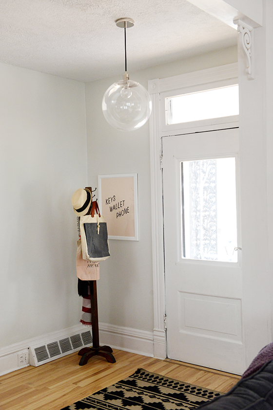
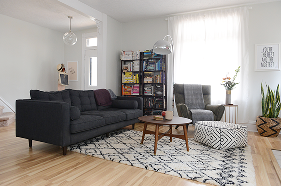
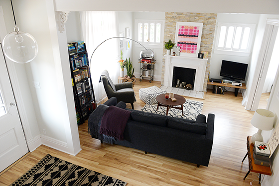
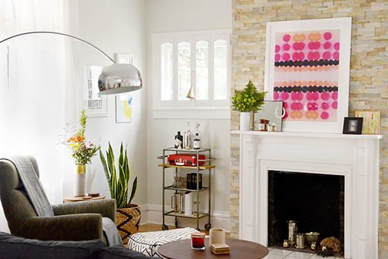
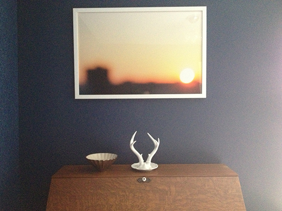
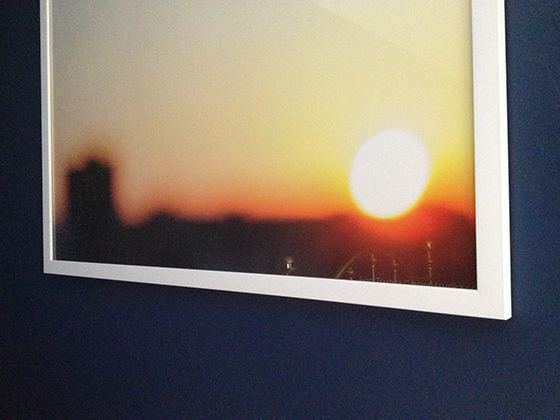
I’ve always had dreams of an entirely white and bright home. One that radiates light and would be the perfect gallery-like backdrop for the myriad of art I possess and love. After obsessing over paint chips I came to the conclusion that a ready-made color wasn’t going to be the answer, so I teamed up with Sherwin-Williams to do a custom color match.


Sherwin-Williams-3-Design Crush


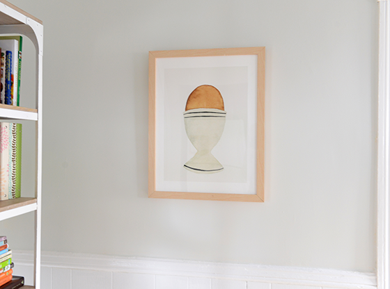
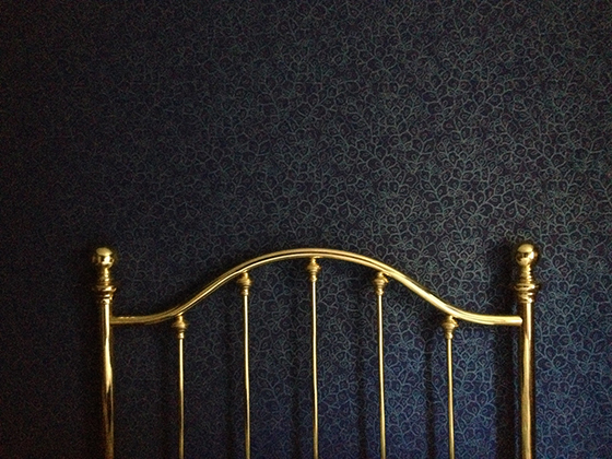
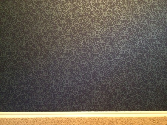
I pried a piece of shoe board off in a doorway and headed over to my local Sherwin-Williams to get their expert opinion and advice. The assistant manager, Jared, gave me a few different color match options after scanning the piece of already painted wood. The two of us spent about fifteen minutes tweaking things until I was 100% happy with the shade. I opted for the darkest to create a small contrast between the walls and 10-inch molding that’s present in the whole house.


Sherwin-Williams-4-Design Crush


I went with Sherwin-WilliamsEmerald line because I’ve used it several times in the past and love the coverage and low odor. Jared also made sure I knew exactly which brushes would be best for the different areas of detail, as well as extension rollers that would help 5-foot-two-inch me reach the top of the 10-foot ceilings. After about thirty minutes I left with the confidence and know-how to tackle this project – did I mention that I’m painting the entire house this shade? Because yeah. The whole enchilada. The end result was a shade of not-white-grey/not-grey-white.


Sherwin-Williams-5-Design Crush


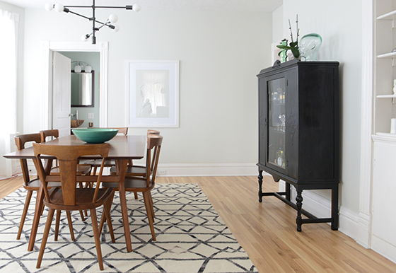
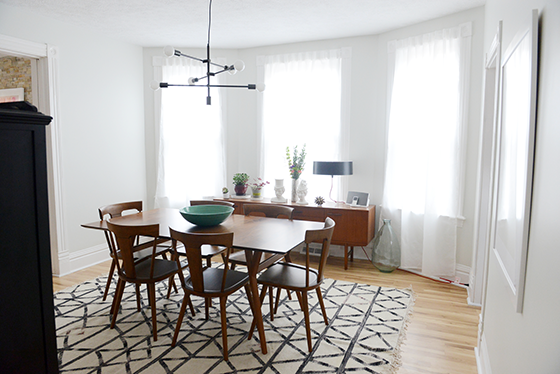
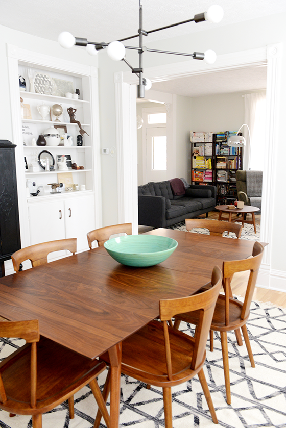
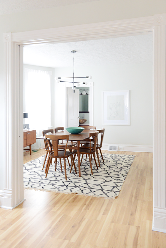
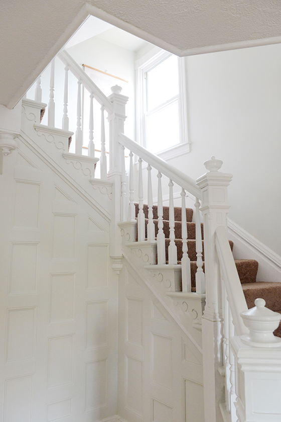
One long weekend and four helping hands later the first floor, staircase, and half of the second floor was done! I’ll be knocking the other two bedrooms and finished attic off the list as soon as it warms up a bit this spring. I’m thrilled with the result so far and guests who have seen the before and after love the look, too.

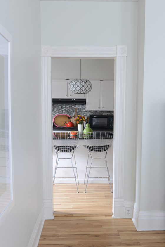
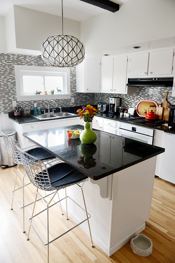
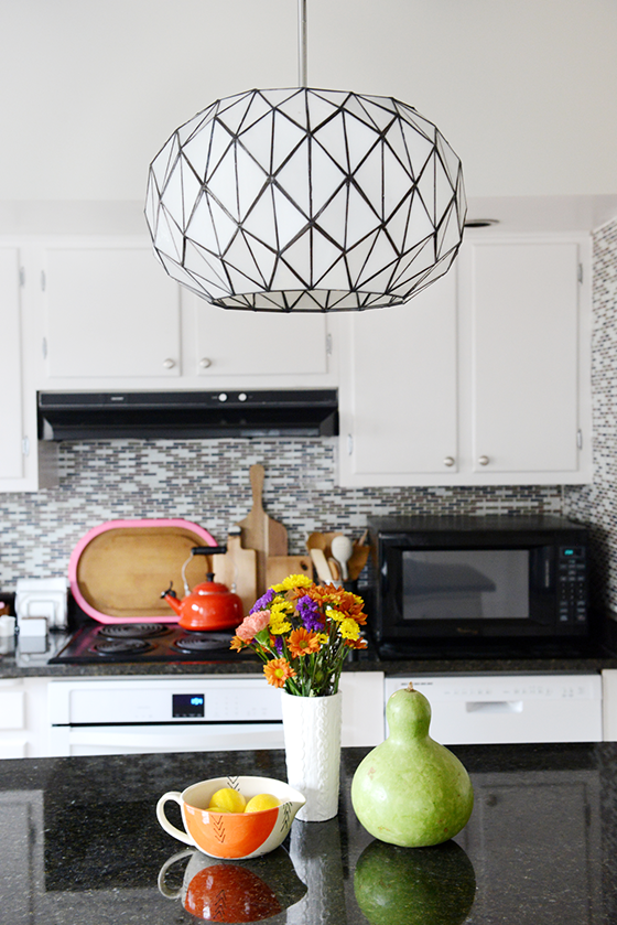
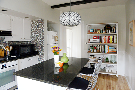
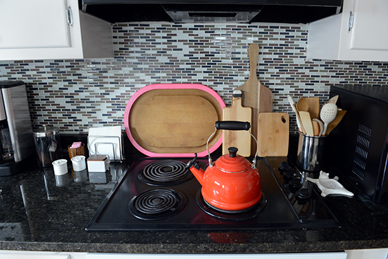
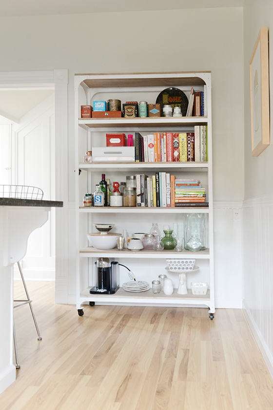
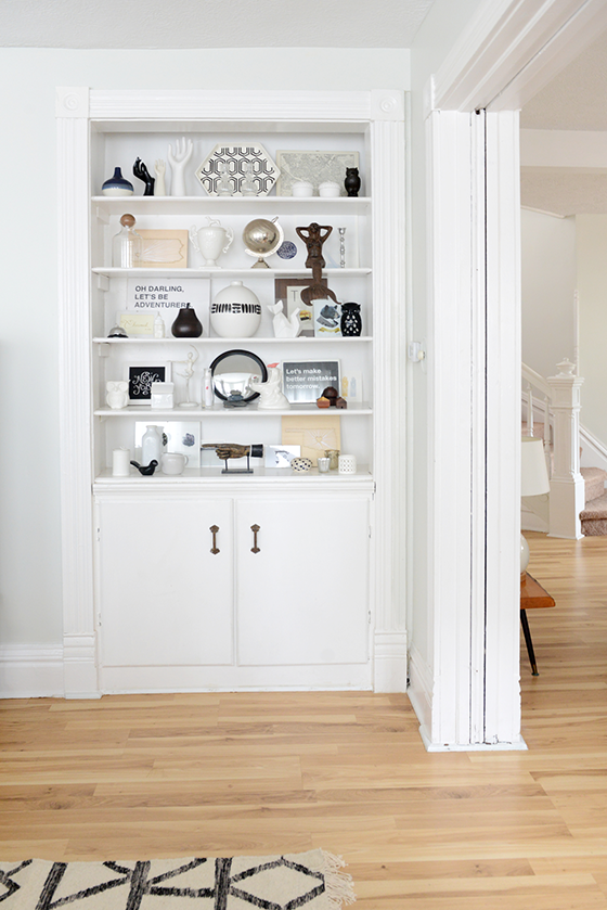
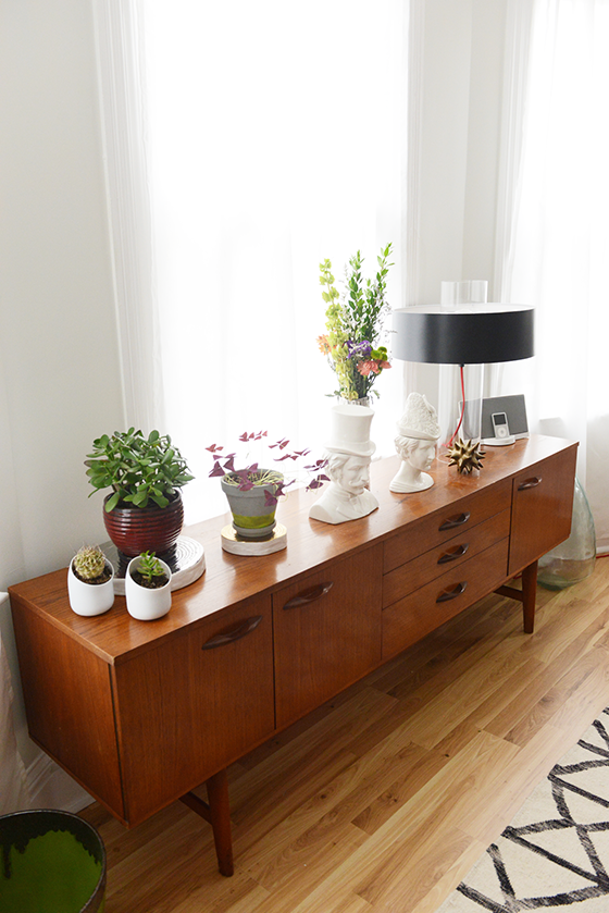
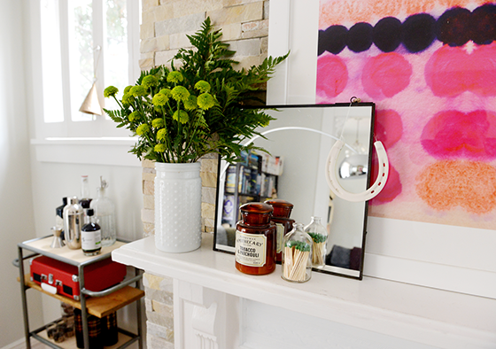
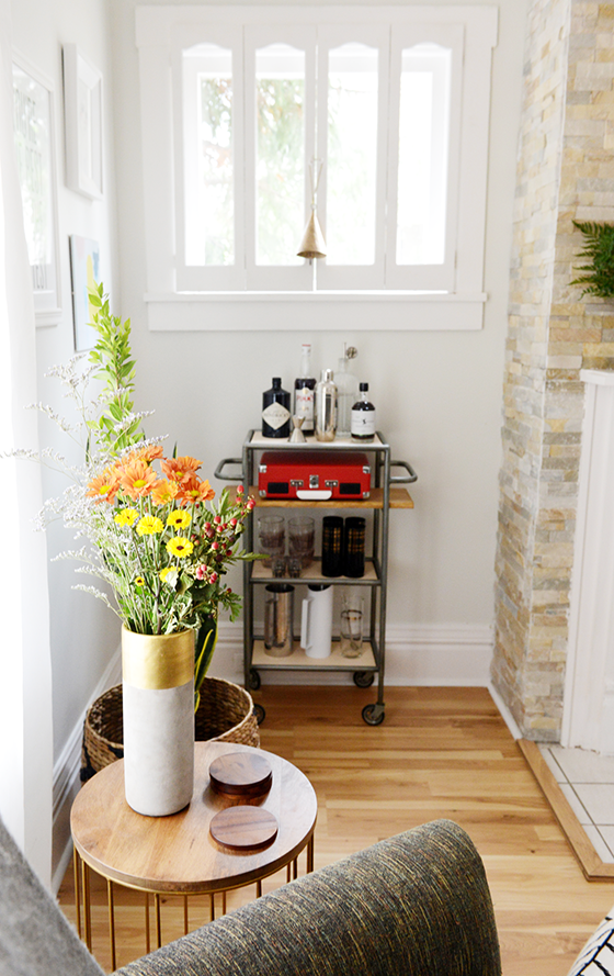
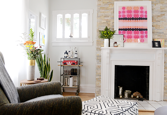
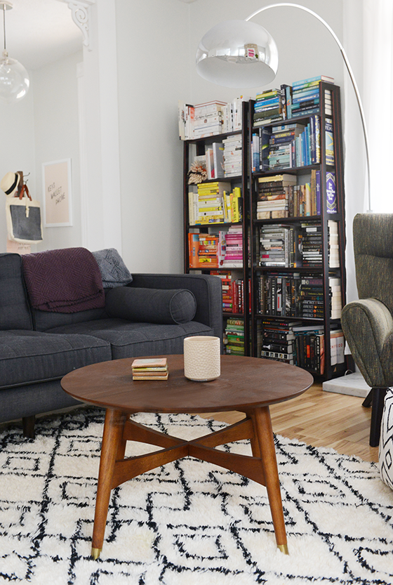
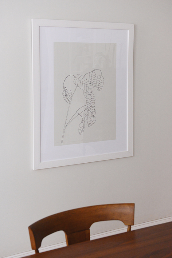
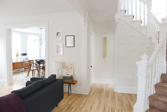
(See the entire first floor – living room, dining room, and kitchen.)

Photos: Quelcy Kogel

Product and consultation provided by Sherwin-Williams. All words and opinions are my own. Thank you for supporting the brands that help keep Design Crush going!

16

The Kitchen

354-Kitchen-7-Design-Crush


Today I’m sharing the last room on the first floor, the kitchen. (The second floor bedrooms and office will be along come spring when I can get around to doing some more decorating.) We’re also going from my favorite room to the one I fight with most often. The kitchen has more “fast fixes” in it than any other part of the house, at least that I’ve found so far. If you look at the doorway floor above you’ll see that the floor of the entire room has been built up about an inch, and both doors into it require you to physically step up. It’s been missed by many a person, many a time.


354-Kitchen-1-Design-Crush


So here we are, and that’s alotta tile. Someone must’ve scored a serious deal because half of the kitchen is covered in the stuff. The plan is to tear it down in a year or so – when those painted 1950s cabinets gets replaced – and instead do a half wall of white subway tile.


354-Kitchen-2-Design-Crush


One of my favorite parts of the room is the Tetra Pendant from Lamps.com that I put in about a month after moving it. With all of the spaces quirks and problems I feel like this pulled a lot of things together and gave it at least a touch of my sensibilities. It’s the first thing that everyone sees when they walk (or trip) into a room that really needed a focal point.


354-Kitchen-3-Design-Crush


The kitchen in my last house had about twice as much cabinet space, it was the room that sold me the house when it came down to it. Here I had to downgrade to a standard fridge from a double-door as well as bring in some additional open shelving. There’s also a small closet/pantry next to the back door that I plan on adding shelves to after the new year.


354-Kitchen-4-Design-Crush


My biggest pet peeve might be that there’s no stove, only a separate oven and cooktop. An old cooktop. That someone spray painted black. There actually wasn’t even an oven when the place went on the market, it was a contingency I added during negotiations. The exhaust hood is equally ancient and I can’t stand that the microwave has to be where it is. But at least the oven is brand new and white.


354-Kitchen-5-Design-Crush


I really like being able to have my cookbooks at arm’s reach, and because there’s not much wall space for art the covers act as just that. I’m also able to display my little vase collection and the ridiculous amount of tea that I rotate through.

There’s definitely a ways to go with this room before I’m satisfied, but I’m also happy with what I’ve been able to do with it on the budget I’ve allowed myself while saving up for bigger renovations.


354-Kitchen-6-Design-Crush

Tetra Pendant c/o Lamps.com // Whitewashed Wood + Metal Shelves c/o West Elm // Edith Bar Chairs – Lulu & Georgia // Le Creuset Red Tea Kettle // The Humble Egg c/o Minted // white sweater knit vase – Target, no longer available

Photos: Quelcy Kogel

4

The Dining Room

354-Living-Room-1-Design-Crush


You’ve seen the living room, now it’s time to get a little more formal.

But first you’ll have to excuse me while I go absolutely ape over my dining room. I love this room more than any other space in any place I’ve ever called home. Everything about it. The huge windows, the stunning light, the floor to ceiling built-in… I could go on.

There are pocket doors between the living and dining rooms (seen here), but they’re blocked off for some unknown reason. I’ve done some investigating (and removing of pieces of frame), but can’t figure out where the problem lies. Looks like it’s a job for the professionals.

I’ve never had a dining room before, and I’ve longed to be the kind of girl who had dinner parties and holiday get togethers at her house without the room to do so. The dining room turned out to be more than I could have hoped for with a mix of old vintage pieces that have followed me around a bit and some new.


354-Living-Room-3-Design-Crush


I was worried the built-in was too busy with my treasures, but a friend reassured me it was a-okay since I stuck to black and white. In the cabinet underneath I store about half of what I refer to as my “entertaining ware” – or the things that only come out a few times a year. I’m thinking I’d maybe someday like to paint the back of the built-in a color like deep turquoise or goldenrod to add a pop, but I’m fantastic as is for the time being.


354-Living-Room-4-Design-Crush


In my last house this vintage mid-century credenza was in my living room, holding my television, records, DVDs, etc. Here it’s serving its rightful purpose as a buffet and hiding the other half of that “entertaining ware.” (Fist pump.) I’m bound and determined to cover it from edge to edge in plants to take full advantage of all that glorious light I mentioned. In fact I’ve added an aloe plant and a Christmas cactus since these photos were snapped a few weeks ago.


354-Living-Room-5-Design-Crush


Another piece that’s followed me a few times is this Depression-era kitchen cabinet that I use as my bar. It’s been one of my favorite possessions for a long time now and it feels so right in this house that’s full of character since it has plenty as well.


354-Living-Room-2-Design-Crush


The original bath (the first of two) is off of the dining room, which is definitely strange. But it’s been renovated and now features a killer glass bowl sink and vanity that you can just see in this shot. I can’t really imagine making overnight guests use it as theirs, so for the time being I mainly use it to bathe the dogs. Since I plan on staying here for some time I can see maybe eventually tearing out the tub and making the pantry that butts up against it on the kitchen side larger. Time will tell.


354-Living-Room-7-Design-Crush


That floor rug just makes the space, don’t you think? I love how it adds a hit of pattern to my otherwise minimal dining room. The mid-century table and chairs set the tone for many dinners to come and the light fixture might as well be a piece of art in itself. (A huge, massive thank you to West Elm for reaching out for a collaboration!) I gave it all a test run last weekend for a birthday party and people gravitated towards the room like a magnet, I don’t think I’ve ever received so many compliments on decorating before. Like I said, OBSESSED.


354-Living-Room-8-Design-Crush

Parker Expandable Dining Table c/o West Elm // Splat Dining Chairs in pecan c/o West Elm // Torres Wool Kilim Rug c/o West Elm // Mobile Chandelier c/o West Elm // credenza (vintage) // bar cabinet (vintage) // large green bowl – handmade // large glass vessel – Pier 1, no longer available // aqua bamboo bowl – Target, no longer available // Sonneman Level Table Lamp – Lamps.com // Male and Female Socialites Busts – immLiving // silver trunk vase – Target, no longer available // Grass with Seeds – Minted

Photos: Quelcy Kogel

16

The Living Room + a Lamps.com Giveaway

354-Living-Room-1-Design-Crush


I posted a sneak peek of the kitchen last week, but this time it’s the real deal. I’m finally beginning to share how my new (old, built in 1900) house is shaping up. I think I’ve said before that I bought this home knowing that it was a flip, and fully expecting all of the weirdness/issues that normally accompany such a project. We’ve already done some updating to a few things – roof repairs, a plumbing issue, bringing outlets up to code, etc – and there are of course still things that need done and yet others I want to do aesthetically. But I’m really starting to feel like this house is much more me than the last one in Oklahoma City. There’s character, there’s charm, there’s quirks. I plan on being here for years to come and I’m so happy to share a bit of the journey with you.


354-Living-Room-8-Design-Crush

354-Living-Room-2-Design-Crush


The living room is directly to the left of the foyer area. One of the main attributes that had me laying down my money for this place was all of the lovely light – 31 windows! – and openness. My last home had 11 windows and it was a big problem area for me.


354-Living-Room-3-Design-Crush


The fireplace isn’t functioning, but I’m hoping to change that once I talk to a professional about what the deal is. I really love the stonework. You can’t tell from this photo, but it’s not all flush and they stick out randomly for some fantastic texture. The interior is black which works really well for featuring other pieces (aside from that MIA fire). My old home had a gallery wall in the living room and it feels really nice to be able to break up my collection a little more here.


354-Living-Room-4-Design-Crush


Before I made the move from Oklahoma back to my home state of Pennsylvania, I sold and donated several things that were no longer my style or not what I saw working in this space. My photographer, Quelcy Kogel, asked me while we were shooting whether minimalism came naturally to me and I had to admit the answer was no. However, I’m loving this more pared down lifestyle that I’ve aspired to for years and am attempting to make it my mindset going forward.


354-Living-Room-5-Design-Crush


I keep going back and forth on whether or not to remove the shutters on the windows flanking the fireplace, but settled for ripping out the old greying lace curtains that came with the house before the movers even had a chance to arrive. I have an unspoken rule that there will always be fresh flowers in this room because they add such life.


354-Living-Room-6-Design-Crush


Another old house quirk – the floors are most definitely not even remotely close to being level, as my bookshelves can attest. While I still find it charming and funny I’d eventually like to invest in some sort of built-in for my library collection that would be slightly more sturdy and, well, level.


354-Living-Room-7-Design-Crush


This is my view every evening as I settle down with the pups and attempt to unwind. There’s a beautiful fir tree just outside the window there and I can’t wait to see it covered with snow.


354-Living-Room-9-Design-Crush


So are you all ready for a giveaway? I thought so. Lamps.com is giving away the 5 x 8′ Tasman Shag Handwoven Rug that I have in my living room. I can’t even begin to tell you how much I love this thing. We didn’t have any floor coverings for several weeks when I first moved in, and the moment this beauty arrived and was laid down both I and the dogs lost our minds. It feels so soft underfoot and Bebe and Piper love sprawling out for a good nap in front of the couch. And if you spy another rug you love on Lamps.com (yes, way more than lamps!), know that every one comes with a free rug pad. Essential for not slipping and giving your piece a good base.


THIS GIVEAWAY IS NOW CLOSED.

To Enter:
1. Simply follow @designcrush and @lampsdotcom on Instagram! Then leave a little comment saying you did so along with your Instagram handle.
2. We’ll choose a random winner next Monday.
3. Good luck!

Reeve Mid-Century Coffee Table c/o West Elm // Gold Wire and Wood Accent Table // Stoneware Cylinder Vase (similar) // Basque Steel Brushed Nickel Arc Floor Lamp (similar) // Heywood Triple Natural Wood Bench // Samantha Armchair // Darrin Sofa // Still Not Scared by Kristi Kohut c/o Minted // Tasman Shag Handwoven Rug // Frontier Flatweave Handwoven Rug c/o Lamps.com // 14″ Globe Pendant c/o West Elm // A Helpful Reminder by Annie Clark c/o Minted // Sometimes I Wish Beginnings Were Ends c/o Jaime Derringer // You’re the Best and the Mostest c/o Read Between the Lines // Ellen by Tuesday Mourning // small painting on mantel by Pippin & Pearl // bar cart no long available

Photos: Quelcy Kogel

43

Win It: Lulu & Georgia

Lulu&Georgia-1-Design-Crush


Today I’m finally sharing a small part of my new home with you! I’ve been eagerly awaiting this day for a few months. Today it’s just a tiny slice, but starting in a few weeks we’ll be moving on to the entire first floor (I hope you’re half as ready to see it as I am to share.)


Lulu&Georgia-2-Design-Crush


So yes, this is clearly the kitchen. Well, about half of it really. I’m going to save the what I love I love/what I hate/what I’ve done/what’s left do rant for the full post on the room, but one of my very favorite parts is this incredible set of Edith bar chairs. They’re easy on the eyes as well as the rear with a generous seat and slim cushion. I’ve never had an island or breakfast bar in any previous kitchen, so I was really excited to find these guys over on Lula & Georgia. They’re perfect for the mid-century vibe that I love and aim for in most of my decor and I know they’ll be a part of my kitchen for years to come.


Lulu&Georgia-3-Design-Crush

Lulu&Georgia-4-Design-Crush

I’m also eyeballing the Henry Vase, Taman Lamp, Rizzo Bench, Ombre Moroccan Rug, and Monica Minimalist Side Table for my home as I figure out what I still need to complete a few of the other rooms.

So I’m about to get to the good part here… which is that you have the chance to win $100 to spend at Lulu & Georgia! Maybe you’re looking for a new throw to keep warm this winter or want to put it towards something larger like a piece of furniture. Whatever you the case, good luck!
a Rafflecopter giveaway

43

The Holidays at Design Crush HQ

Holiday2013-1-Design Crush

In a normal year my Christmas tree goes up the Saturday after Thanksgiving. This year it went up the Friday before, I had the itch to decorate and scratched. I blame it on the perfectly chilly day full of sleet that that Friday was, but think it had just as much to do with the abbreviated holiday season we’re experiencing in the U.S. this year.


Holiday2013-2-Design Crush


Holiday2013-3-Design Crush


Holiday2013-4-Design Crush

I love pulling out all of the ornaments I’ve collected over the past ten or so years. All pink, blue, silver, and white for the most part. For 2013 I changed things up a bit by adding silver garland to the mix, a first ever for any tree I’ve ever decorated. (If I’m too crazy for you, I totally understand.)


Holiday2013-5-Design Crush


Holiday2013-6-Design Crush

When I decorate for the holidays I don’t like to disrupt everything, but rather add here and there to enhance. A few ceramic faux bois platters on the cocktail table, a bunch of eucalyptus in a hippo vase, and of course some seasonal candies. A metallic snowflake hanging from a lamp, a few pomanders, and a candle on the credenza… we’re getting there!


Holiday2013-7-Design Crush


Holiday2013-8-Design Crush

The fireplace and mantel were strung with Edison bulbs and a banner begging for snow, as well as a few mercury glass and bottle brush trees. A set of silver finials and some woodland creatures help round it all out.


Holiday2013-9-Design Crush


Holiday2013-11-Design Crush


Holiday2013-10-Design Crush


Holiday2013-12-Design Crush

A few bits on the kitchen cabinets and a bauble on the hall closet door, a favorite card over there in the guest bath, and some gold tinsel hanging around a frame. That’s how we do Christmas at Design Crush!

0

Make My Crap Your Crap MEGA Garage Sale

Mega-Garage-Sale-Design-Crush

The Make My Crap Your Crap MEGA Garage Sale has been moved to next Saturday, 10/5 due to a 100% chance of severe storms.

Believe it or not this garage sale has been in the works for over two years. I just couldn’t get my act together and had a million and one excuses. So instead my guest room was filled to the brim (literally, I could barely open the door) with every single unwanted thing I’d been corralling since I moved into my house. Five years ago.

I can thank Go Mighty for helping me get it done, this sale is actually an item on my Life List believe it or not. That’s how much I want to get it taken care of it. And because I’m attending Camp Mighty next month and in the process of raising my $200 for Charity: Water there was no better time to get my ass in gear and no better reason for you to come buy all of my crap.

One other thing. I’ve never had a garage sale before, so this is all off the cuff. I’ve got my permit, my tables rented, etc for the big day this coming Saturday but I’m kind of nervous. What if no one wants my stuff? So if you’re in the Oklahoma City area and would like to attend, just drop me a comment and leave your email address in the form. I’ll reply with the location the day before (you know, creepy stalkers need not apply and all). There might even be some snacks and beverages waiting for you! (There totally will be.)

10

The Guest Room // The Bedding

Guest Room-Crane&Canopy-1-Design Crush


With my guest room’s walls being so dark, I really wanted to leverage other accents within it to bring in some brightness. As in most bedrooms the bed is the focal point, and with this room being small (12′ x 12′) I knew I wanted to capitalize on using light colored bedding.


Guest Room-Crane&Canopy-2-Design Crush


Enter Crane & Canopy’s Octavia duvet set. The most perfect silver-grey jacquard there ever was, overlaid with an abstract pattern of mums. Not terribly girly for my male guests, just a very nice neutral that opens up the entire space. And I think everyone who spends the night in this bed will appreciate how uber soft the 350-thread-count set is to the touch. In fact, I need to try it out myself – they say you should always stay over in your own guest room to make sure it will be comfortable for future occupants. (And yes, I should definitely iron that duvet out!)


Guest Room-Crane&Canopy-3-Design Crush


Guest Room-Crane&Canopy-4-Design Crush


Disclaimer: Octavia Duvet Set provided by Crane & Canopy. All words and opinions are my own. Thank you for supporting the brands that keep Design Crush going!

0

The Guest Room // The Wallpaper

Guest Room-HGTV Home:SherwinWilliams-1-Design Crush


I’ve never been big on wallpaper. Most of it just brings back awful memories of the two walls of my childhood bedroom that were plastered with some sort of navajo print. That I picked out. To go with the other two walls that were painted peach. PEACH! So you can see why I’ve steered clear for so long.

But over the past few years I’ve noticed a change in the tides. Wallpaper prints that I actually like, some of which that have been designed by artists I respect and admire. So when it came to the guest room I thought, well, it’s now or never.


Guest Room-HGTV Home:SherwinWilliams-2-Design Crush


So I started searching out wallpaper options and fell for something I never would have expected. This detailed pattern from HGTV Home by Sherwin-Williams in a deep, dark navy blue overlaid with an almost metallic grey print – it’s the 441-5610 design and is a part of their Coastal Cool collection. The wallpaper is a thick and heavy quality paper, which added a little bit of a challenge to the actual hanging but gave us such a beautiful result. And because of the detail it’s virtually impossible to see the seams. I’m so happy with the end result, and so thankful for the help of my friend Tab who did most of the dirty work because this is most definitely a two-person job.

What’s your stance on wallpaper? 

Disclaimer: Wallpaper provided by Sherwin-Williams. All words and opinions are my own. Thank you for supporting the brands that keep Design Crush going!

5

The Guest Room // The Art

Guest Room-Saatchi Online-1-Design Crush


Because the accent wall of intricately patterned wallpaper takes center stage in the guest room I really wanted to focus on having one main piece of art. My initial plan (pre-paint, pre-everything) was to hang a large print over the bed. But once I got the headboard in the room and realized it rose considerably higher than I remembered that plan went right out the window. Instead I chose this photography piece from Ivan Tsupka’s Minimalscapes series through Saatchi Online.


Guest Room-Saatchi Online-2-Design Crush


That luminous sun and white frame pop in a big way when hung against the navy wall. Saatchi Online has so many great artists that it was really difficult to decide, but I’m so happy with the direction I went. I also think it contrasts nicely with the secretary desk and white accessories directly underneath for a nice minimal look.


Guest Room-Saatchi Online-3-Design Crush


Disclaimer: Framed art provided by Saatchi Online. All words and opinions are my own. Thank you for supporting the brands that keep Design Crush going!

3